Reeva
A young Saudi agency that refused to look like every other agency. Reeva needed a brand for founders who would rather be noticed than blend in.
Model
B2B
Services
Brand Strategy
Visual Identity
Brand Video
Location
Saudi Arabia
Year
2025
Industry
Marketing & Creative Agency
The Brief
Overview
Reeva is a marketing agency built for founders at the start of their journey, from the idea stage to early market entry. In February 2025, as art director, I led the brand strategy, creative direction and all visual design for the agency’s own identity. That covered the logo, the guidelines, the company profile, social media direction and a brand video.
The Challenge
There’s an Arabic saying for this: “باب النجار مخلع”, the carpenter’s own door is broken. Agencies pour care into client work and leave their own identity for later. Reeva also launched into a crowded field, where many Saudi agencies shared similar voices, typography, colours and safe, minimal layouts. The aim wasn’t to win everyone over. It was to look unmistakable to the founders Reeva wanted to work with.

Solution
An energetic, deliberately non-corporate personality, and then that attitude turned into a system strict enough to run a business on.
Narrative & Strategy
I started with the audience: young founders with ideas, tested products or a fresh seed round. Most were Gen Z, but not all. They relate to energy and plain talk more than corporate polish, so I used the brand itself as a signal of fit. Before exploring anything, I asked what felt corporate or low-energy and moved away from it. I tested four territories: Safe Professional, Friendly, Arab Gulf Creative and Festival-ish. Then I chose bold and youthful, accepting that some people would find it too loud. The offer followed the same thinking. A Foundation Package bundled branding, a company profile, a website and starter social content, which is everything a new business needs to show up.
Visual Identity
I built a star-and-pixel system in English and Arabic. The smooth four-point star stands for visibility and ambition, and it contrasts with stepped pixel lettering in Kubo and TS Pixopedia. Purple leads, with electric purple and yellow adding intensity. Pixels do structural work, not just decoration. They divide layouts on a 20 × 20 grid and frame images across decks and social posts. I didn’t trade readability for personality. Display type carries the character, while Urbanist and Alexandria handle longer text. Two modes keep it practical: Electric for ads, social and motion, and Formal for decks, letterheads and legal documents.
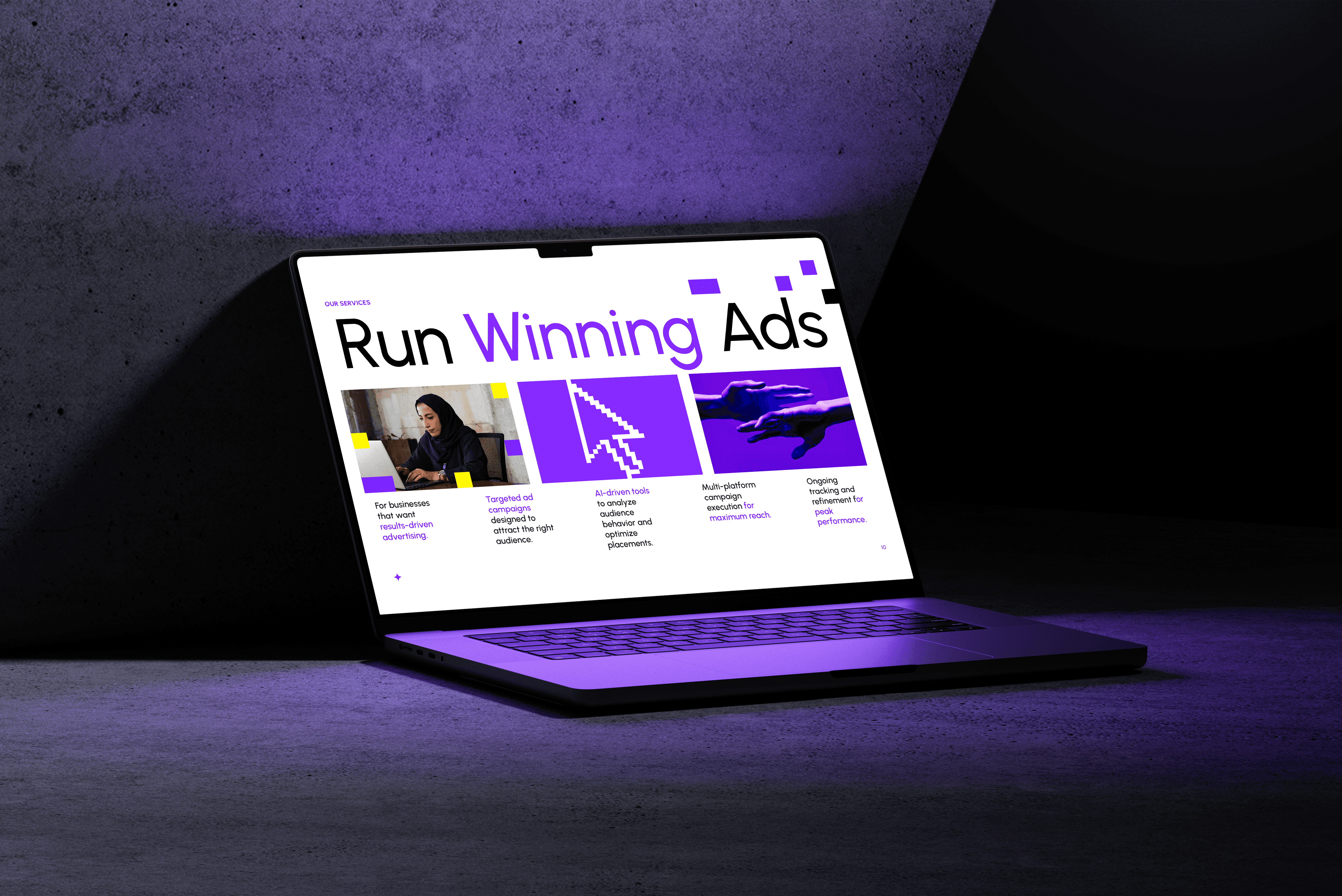


Bold, but Usable
Two application modes let Reeva go full electric in a social ad and still send a clear, credible proposal the same afternoon.


Outcome & Impact
Outcome
The identity went straight into real business use: the live website, a company profile used in several variations, social media and a launch video. The video carried the brand’s energy into motion through rapid cuts and a beat-driven rhythm. Because the guidelines include templates, grids and rules, Reeva’s team can grow the system without its original designer in the room.
Impact
In sales meetings, prospective clients said they’d seen the ad, the site or the social posts and felt a connection to Reeva’s energy. Reactions were split, which is exactly what a polarising direction is meant to do: some found it too loud, and the right people loved it. After the founder promoted the video as an ad, new clients came asking for work with the same energy.
