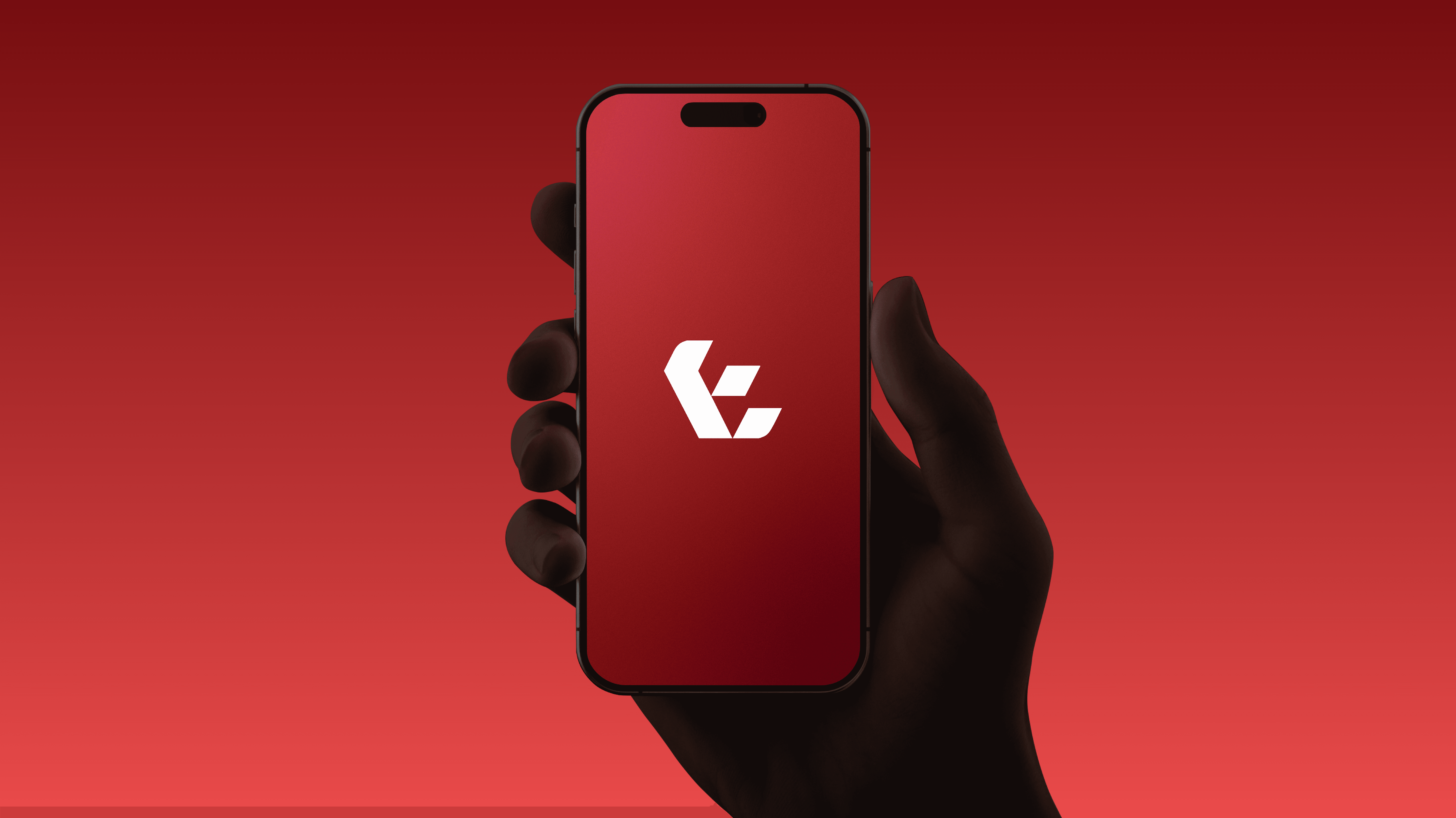
Hotel Plus
A business moving beyond hotel systems to connect travelers and hotels on one platform. One that paired the ease of technology with the warmth of hospitality.
Model
B2B & B2C
Services
Brand Identity
Company Profile
Interface Concepts
Location
Saudi Arabia
Year
2025
Industry
Hospitality Technology

The Brief
Overview
Hotel Plus started out building software and hardware for hotel managers. In early 2025 the company planned a larger move: a two-sided platform where travelers book and manage their stay, and hotels run their operations and guest services. I took over the rebrand, covering discovery, creative direction, the identity, the company profile and the interface concepts that brought the proposition to life.
The Challenge
The old identity spoke to hotel operators and little else, and it didn’t reflect where the business was heading. The new brand had to serve two very different audiences at once. Hotel managers needed to see a credible operational partner. Travelers needed to feel the ease and enjoyment of a trip, whether they were coming for tourism, religious travel to Mecca and Medina, destinations like AlUla, or business. On top of that, the platform didn’t exist yet. The company needed to pitch a product it could not yet show.

Solution
I made an ambitious technology platform feel human, then made the product visible before it was built.
Narrative & Strategy
After a discovery call with the founder, I reviewed the company’s existing material and distilled it into a working vocabulary: adventure, culture, comfort, digital, simple, friendly. I studied the visual landscape of travel and booking brands such as Booking.com, Airbnb, Almosafer and Rehlat. My read was that technology branding in the space leaned cold, and that Hotel Plus had room to feel warmer and more welcoming. I set three goals: capture the energy of travel, signal a seamless digital experience, and reflect Saudi warmth. I kept the cultural references deliberate and mostly in colour, so the brand would stay open and internationally accessible to visitors from abroad. The founder was hesitant at first, as the direction was a clear break from the old brand. I walked him through why a two-sided platform needed a contemporary, human expression across every touchpoint, and he accepted it.
Visual Identity
The founder wanted the name present in the mark, so I built it from three ideas: the H of Hotel Plus, the shape of a home, and a plus sign for added value. The H’s crossbar rises into a pitched roof, with the plus sitting at its shoulder. Manrope handles English and Alexandria handles Arabic, giving both languages a clean, modern voice. The palette is green #489F80, orange #FF6C4A, desert pink #FFD4B5 and yellow #F6C744, drawn from palms, desert sand and sunshine. I blended them into soft gradients as a digital backdrop. The home and plus shapes became a pattern system that works as image frames, containers and accents across social and print.


Showing Before Building
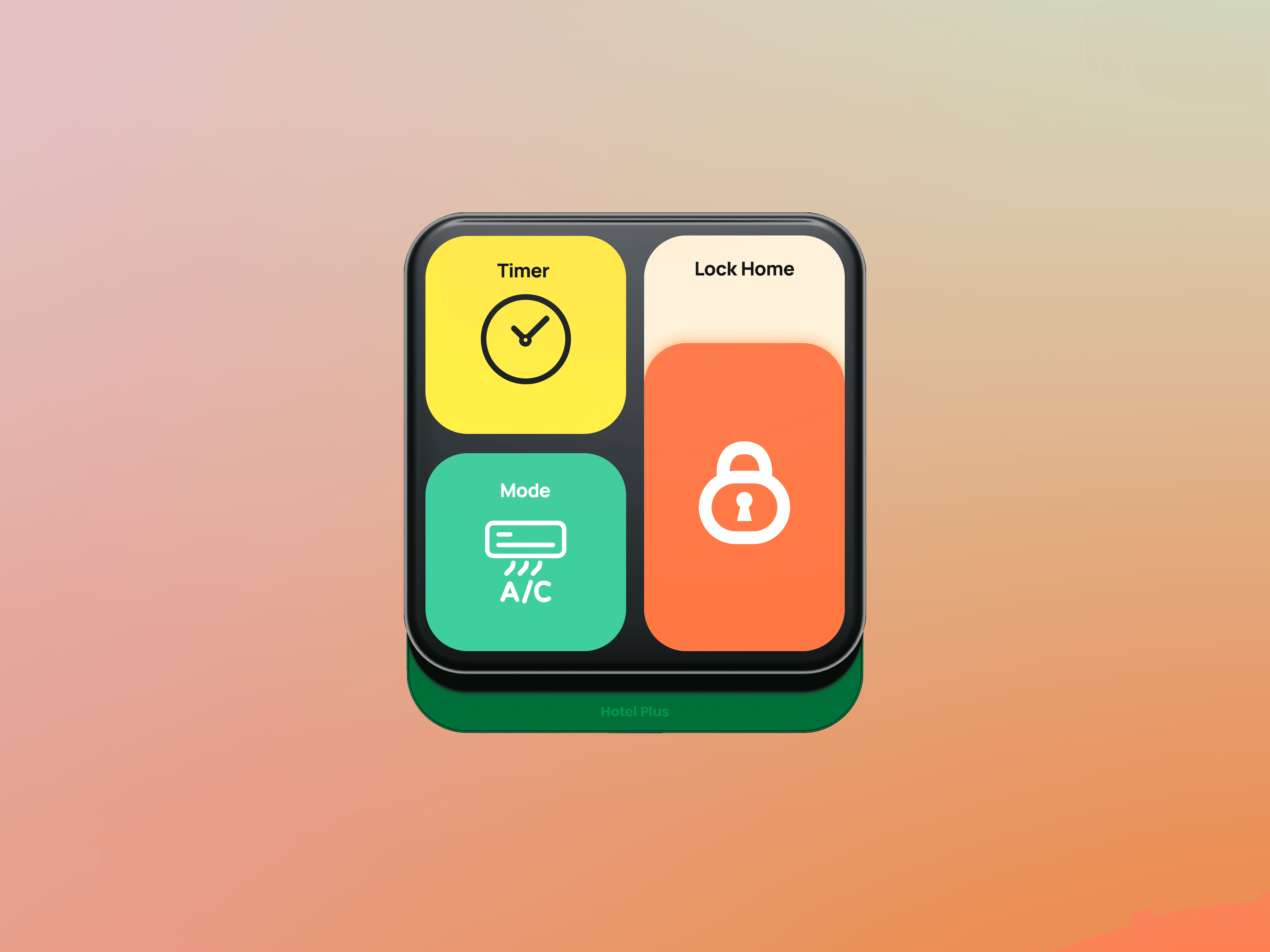
Interface concepts gave the company profile something concrete to point to, so the pitch didn’t depend on a product that was still being developed.


Outcome & Impact
Outcome
The identity came with a complete brand guide covering logo usage, bilingual typography, colour, patterns and applications. It was then put to work in a company profile with interface concepts for both sides of the business. Traveler screens showed booking, live support, digital check-in and room keys. A hotel dashboard showed the same brand adapted for daily operations. These were visual demonstrations of the identity, not a working product, and the engagement ended at this stage.
Impact
The founder now had a way to pitch a product that didn’t exist yet. The company profile turned an abstract proposition into something investors, partners and hotels could picture. Above all, the founder went from hesitant to convinced, and the business left with one coherent identity that speaks to travelers and hotel operators alike.