Ecomaster
A logistics system becoming an AI procurement platform. EcoMaster needed a brand that said software, not trucks.
Model
B2B
Services
Brand Strategy
Visual Identity
Company Profile
Location
Saudi Arabia
Year
2025
Industry
Procurement (F&B)
The Brief
Overview
eComaster started as a simple system for managing logistics. In 2025 the business turned toward cloud-based procurement automation for restaurants and cafés, built on AI, data analysis and automated ordering. I handled the rebrand: strategy, visual research, logo exploration, the identity system, the brand guide and the English company profile. The founder set the vision and judged every direction.
The Challenge
A symbol can be accurate and still tell the wrong story. A mark built on speed and movement made eComaster look like a company that moves goods, when its value is the software that manages them. The identity had to feel technological and future-facing, stay tied to procurement, and work in English and Arabic. The platform also had ambitions beyond F&B, so the brand couldn’t be boxed into one category.

Solution
I moved eComaster from the look of logistics to the look of software, then gave the brand a graphic language drawn from how procurement works.
Narrative & Strategy
I started with strategy sessions and visual research across SaaS and AI brands, studying how they earn credibility, and how Saudi and Gulf procurement competitors present themselves. My read was that competitors led with operational usefulness and had no strong technology identity, which left room for a brand that looked like software. I distilled the direction into twelve keywords, including clarity, control, precision, trust, scalability and software. My first routes were wordmark-led: a wordmark alone, with an arrow above, and with an arrow built into the lettering. The founder rejected the arrow. It was generic, and it described field operations, not management software. He was right, and I treated it as a change of direction, not a refinement. I returned with four symbols: a box with a lowercase e and network lines, a minimal cart, a geometric box, and a capital E that combined software layers with a warehouse cart. The layered E won. It carries the company’s initial, the structure of software and the act of procurement in one angular mark.
Visual Identity
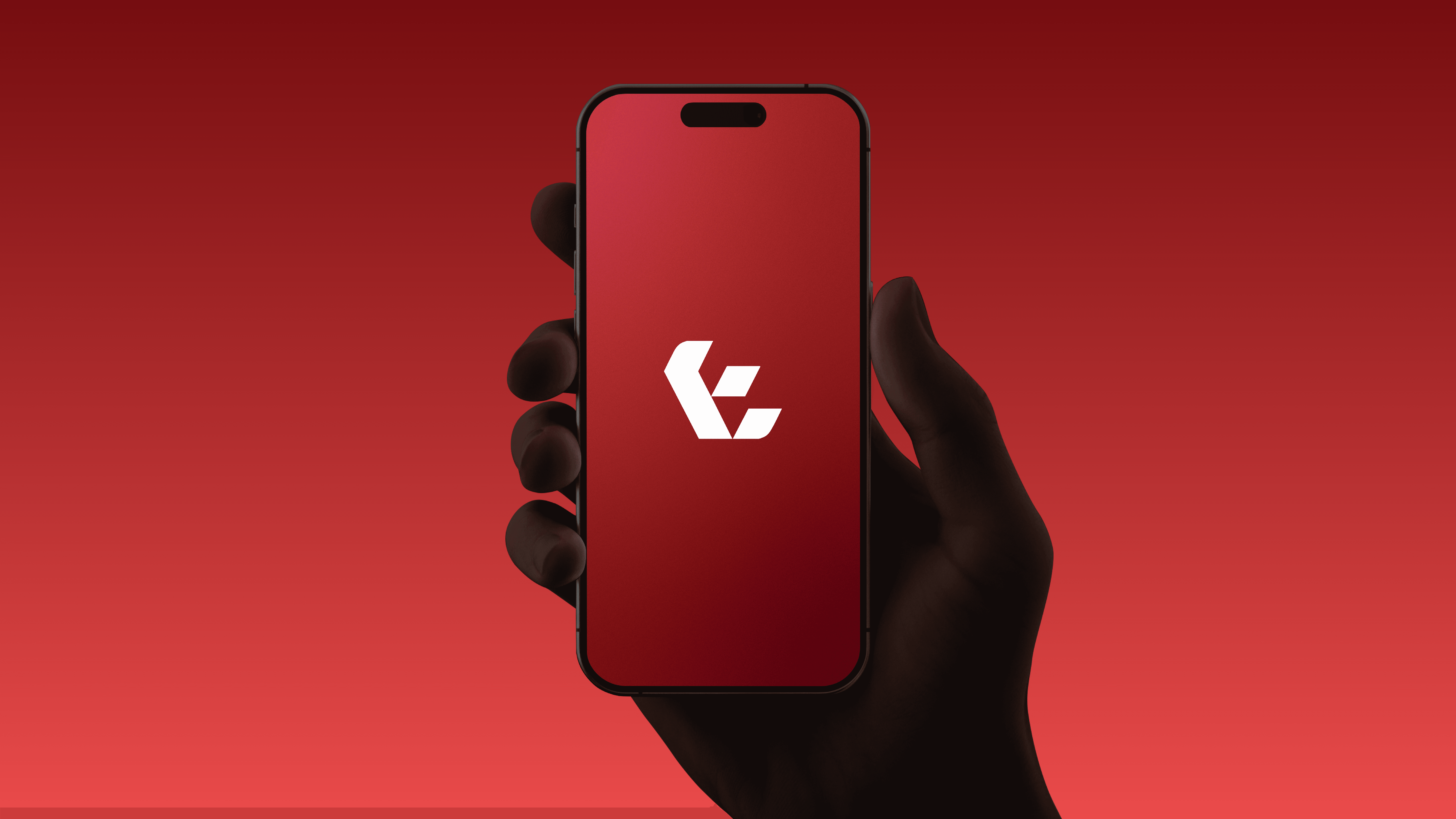
The logo pairs the E symbol with the wordmark in SK Concretica, chosen for its geometric precision. Gilroy carries English body text and Changa carries Arabic. The palette is a deep red foundation with warm yellow accents and neutral contrast, supported by gradients that give the brand depth and a digital feel. The signature device is a pattern system built on the five Ps of procurement: power, people, process, planning and prevention. Each concept has its own base shape, and repeating, rotating and layering those shapes produces patterns from quiet backgrounds to large graphic forms. The guidelines cover the rest: logo variants, usage rules, bilingual typography, color, gradients, patterns, social templates and application examples.


Every touch-point feels tied
The interface inherited the brand’s sharp angles and modular shapes, so every screen carries the precision of the logo and reads as the technology the brand promised from the very start.


Outcome & Impact
Outcome
The identity shipped with a full brand guide and a 17-page company profile that applies the system to the product story: cost control, auto ordering, inventory, a closed marketplace and more. The internal team put the brand to use. The external company that designed the interface worked from the guidelines, which shows the system could be built on by people who weren’t in the room.
Impact
According to the founder, eComaster’s revenue grew 4× in the year it launched its new brand and business direction. He credited the brand with helping communicate the shift. That year was also a wider business transformation, so I don’t claim the identity did it alone. What I can say is that the brand made the new direction easy to read, and the project taught me to listen when a client rejects something that looks right. The rejected arrow led to a better mark.
