Elmorashid
A Saudi product that saves power was heading into a fundraise. It needed a brand that investors would read as clean, credible and local.
Model
B2C
Services
Logo Design
Brand Identity
Investor Pitch Deck
Location
Saudi Arabia
Year
2025
Industry
Energy Technology

The Brief
Overview
ElMorashid is a Saudi hardware product built to save power. The company had an existing brand, but it was raising money, and it needed an identity and an investor pitch deck that could stand behind the ask.
The Challenge
A raise runs on first impressions, and the old identity wasn’t helping. Its lamp-style mark pointed at lighting, while the product is about saving power. The new brand had to do three things at once: connect clearly to the product category, signal sustainability and still feel Saudi.

Solution
A brand with one job: make saving power look like a business worth funding. Category in the mark, sustainability in the color, clarity in the space.
Narrative & Strategy
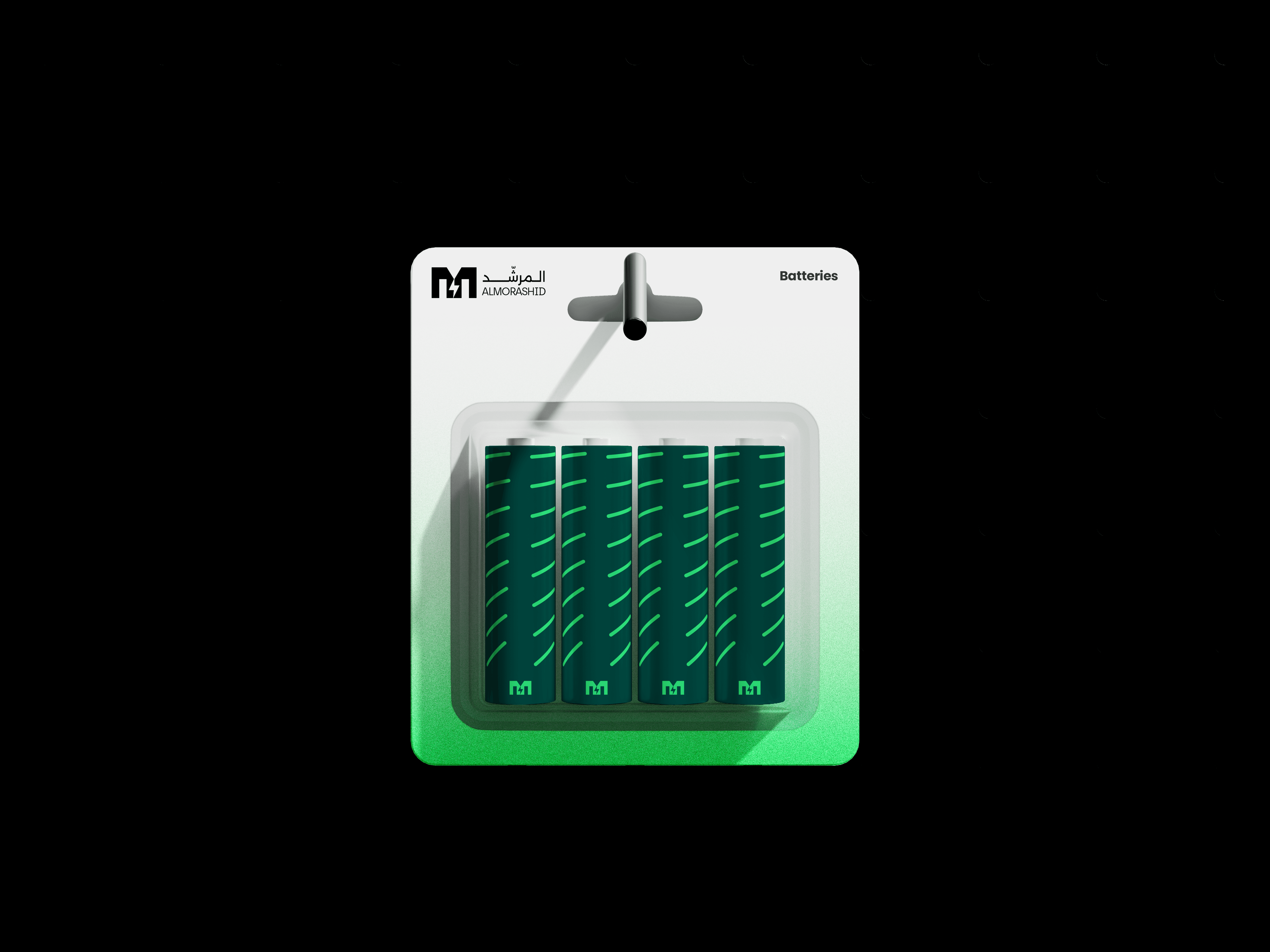
The old lamp suggested light. The product’s value is power saved, so the mark had to say that. I built a new logo from the company’s initial: an M that incorporates a power symbol. The power symbol ties the identity straight to the product category.
Visual Identity
Green leads the palette. It signals sustainability and environmental change and also evokes Saudi Arabia, so one color does both jobs. Generous negative space keeps every layout clean, echoing the clean-energy positioning. Circular linework runs through the system as a recurring motif that reinforces the sustainability theme.

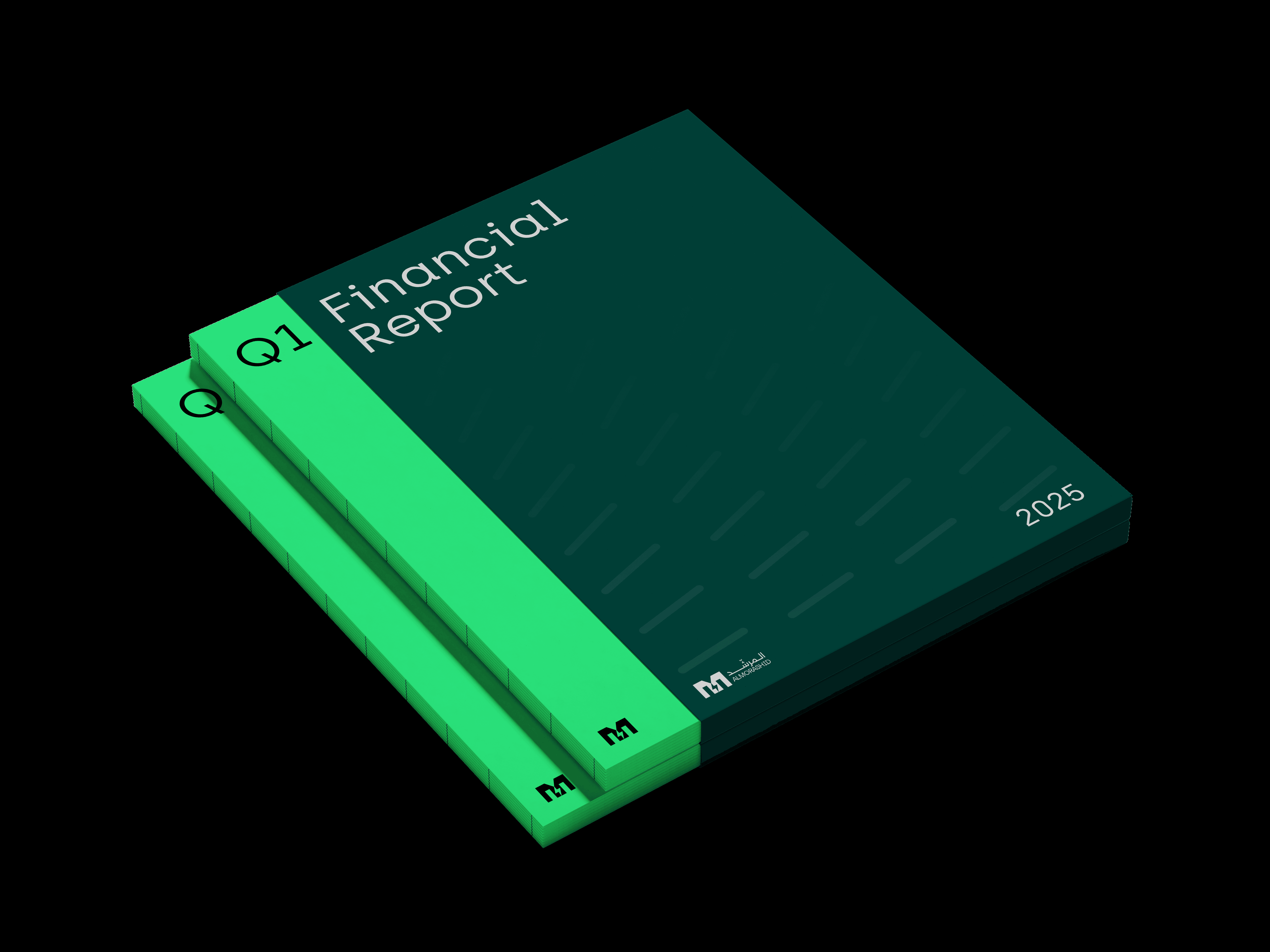
Built for the pitch
Green, white space and circular linework run through every spread of the investor deck.


Outcome & Impact
Outcome
We now have a brand we’re proud to hand across a table. It sets the tone for every pitch before we say a word.
Impact
Clearer positioning in new-business conversations and a noticeable lift in the quality of inbound enquiries.
