Data AI
One question: what makes an institution comfortable trusting an AI company?
Model
B2B
Services
Brand strategy
Visual identity
Logo refinement
Location
Saudi Arabia, GCC
Year
2026
Industry
Enterprise AI & Financial Data

The Brief
Overview
Data AI combines artificial intelligence, data analysis, and financial insight for banks, government institutions, and private organizations across the GCC. Security, accuracy, and cost-effectiveness were already part of the product. The brand needed to say so plainly. I led the brand strategy and refreshed the visual identity, from research through to the 2026 brand guidelines.
The Challenge
Most AI and fintech brands in the region lean hard on looking technological. That makes them recognizable, and it also makes them distant. Data AI’s audience had two worries: can we trust this company with sensitive data, and can we rely on the analysis? The team also wanted a Saudi brand that spoke naturally in Arabic and English, and felt youthful, polite, friendly, and credible all at once.
Solution
Trust was the brief. The answer was a brand that never argues for itself: direct words, ordinary people, and room around every message.
Narrative & Strategy
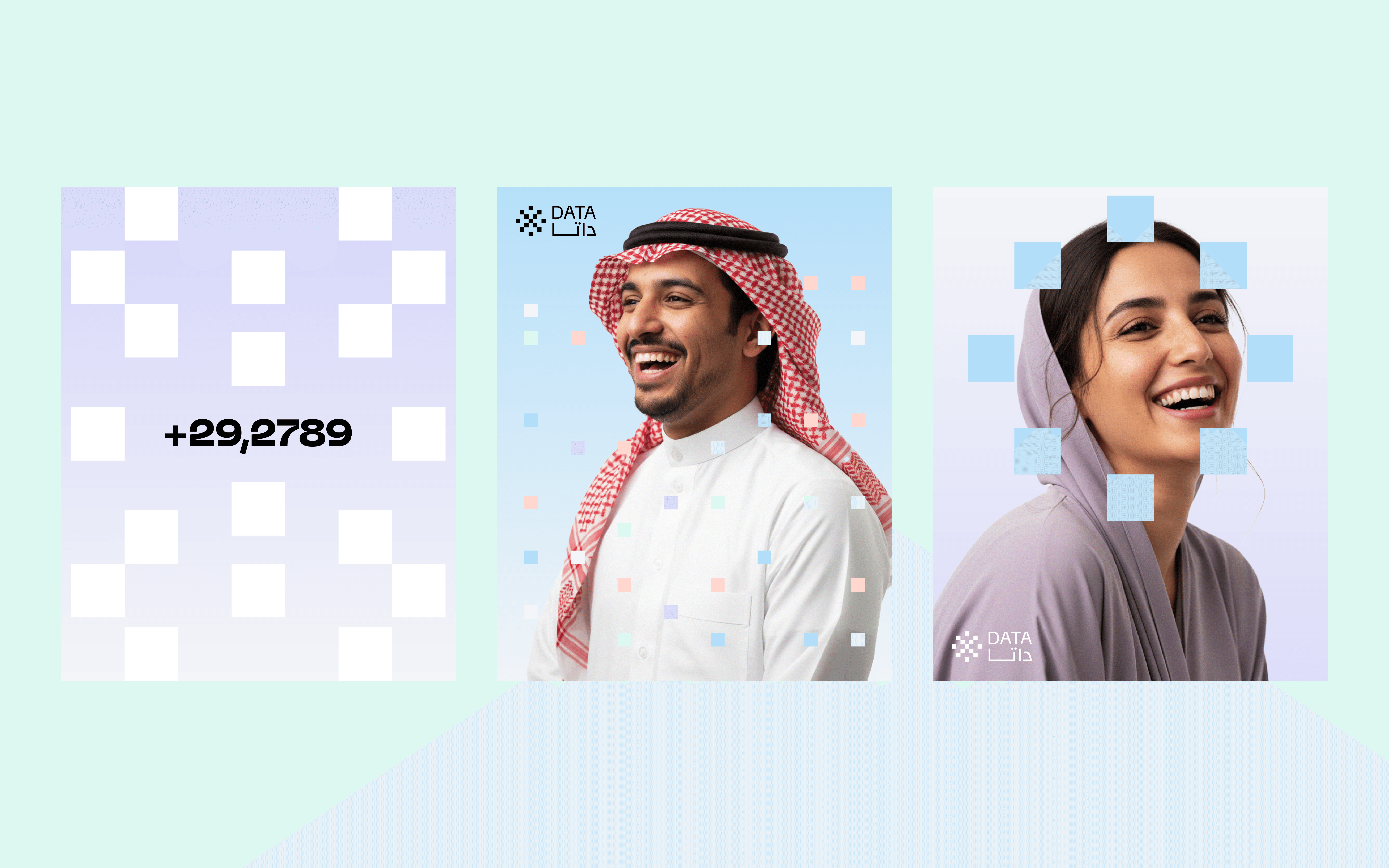
I started with how AI, data and fintech brands present themselves across the GCC. Most leaned hard into looking technological. That made the category recognizable and left room for a brand that felt easier to approach. Discovery made the opportunity specific, and it led to one rule for the identity: say what you mean and make it easy to understand. To someone already skeptical about AI, a wall of explanation feels defensive. So the language stays direct and honest, and the layouts give each message room to land. Photography does the same job visually: approachable people, natural expressions, familiar settings. A team working together makes AI easier to picture than another abstract technology image.
Visual Identity
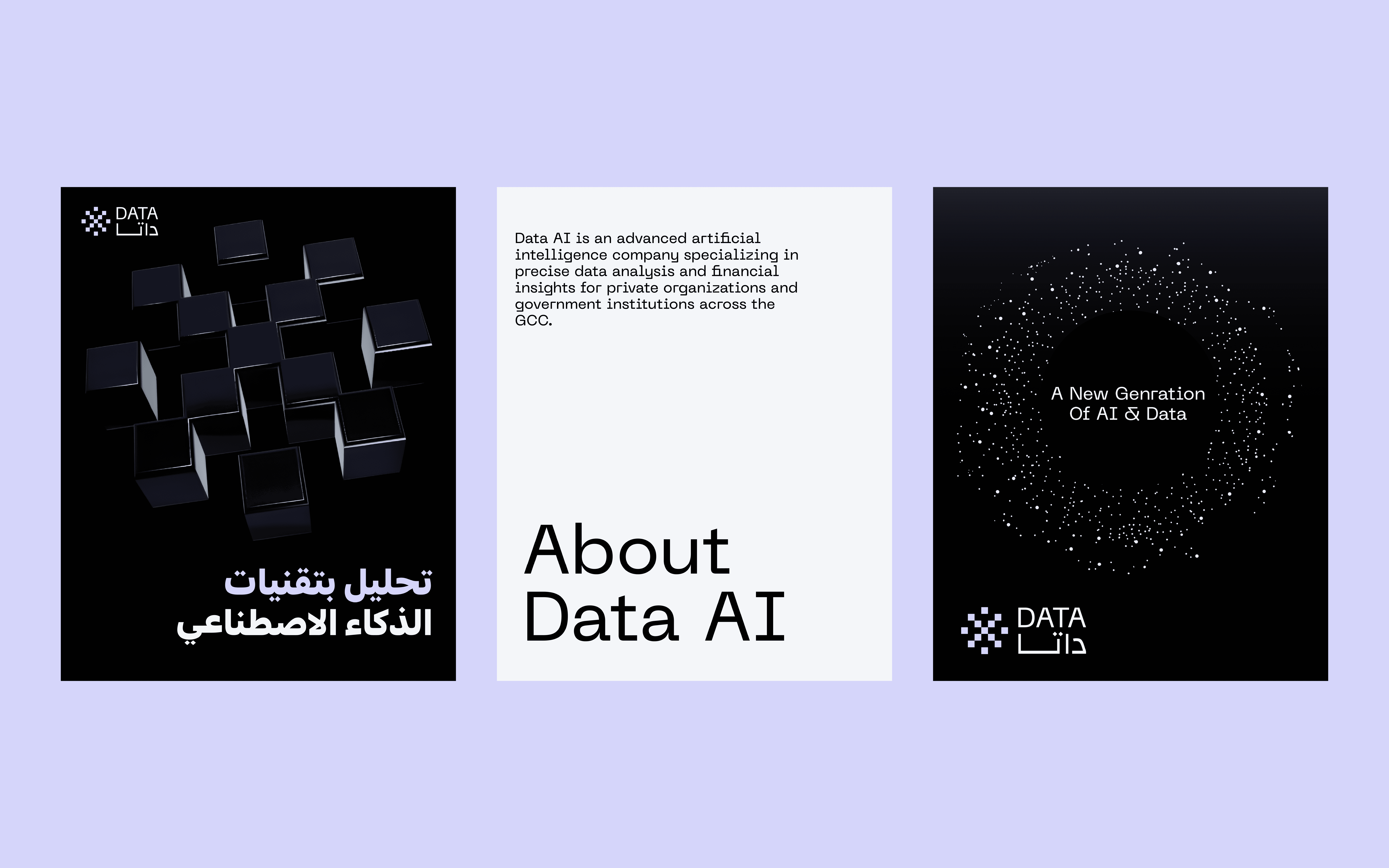
The client liked its original five-dot mark, so I started there and redrew it as a balanced, star-like cluster of 13 squares. The pixel geometry links the mark to data, and the symmetry reads as separate points coming together into something legible. A clean Arabic and English wordmark completes the lockup, so the identity is bilingual from the first encounter. Repeating and scaling the mark’s squares produced the graphic patterns, which carry the same language where the logo plays a smaller role. Soft purple and blue keep the technology association with a gentler tone. Green ties the palette to finance and growth, off-white gives type and imagery room, gradients move colors across larger surfaces, and a muted orange adds warmth.pine, stone, and evening light on the lake.


Tech in the mark, human everywhere else
Natural expressions and easy smiles bring warmth to Data AI. The mark’s squares scatter and regroup into playful patterns across the layouts.


Outcome & Impact
Outcome
Mockups showed the logo, color, typography, patterns and photography working together in context. Once the direction was approved, I developed the 2026 brand guidelines. They cover the bilingual logo and its variants, spacing and placement, English and Arabic typography, color and gradients, pixel patterns and photography. They also explain the thinking behind each choice and show everything together in an application gallery.
Impact
The client kept the mark it already liked, now rebuilt as a system. A reader can recognize Data AI as a technology company through its pixel geometry and meet it as an approachable partner through its language, color and photography. The guidelines make that balance repeatable for anyone applying the brand.
